[20 Years Ago, Part 14. Other options: prior post or start at the beginning.]
Getting the product ready in time was only half of the challenge for our January launch. The other half was getting all of the marketing items done on deadline. And in 1995, that meant dealing with multi-week workflows to create and purchase print advertising and to design and produce print collateral and video sales tools.
And to really get started on any of those projects, it was vitally important to have locked down the “identity” of the product: its name, its tagline and fundamental positioning, and its logo or visual identity.
As those of you who have been following this series know, the project was pitched to the leadership of SGI with the name “Spider” and the tagline “Now making a web comes naturally”. In the weeks that followed, that positioning started to feel weak to me. While it had the benefit of obvious analogy, it lacked any sense of the strategic land grab that I intended for the project. Also it seemed more appropriate for a singular product, rather than a product line that spanned multiple configurations of workstations and servers.
The search for a more appropriate identity had a very clear center of gravity; the organizing principle of the entire effort was that the web was the most important thing in all of computing. The web was the Big Wave that everyone needed to pay attention to.
And yet, there was not a single product that had “web” in its name at that time.
So, each day in late November and the first week of December, I thought up different web-based names. On the morning of Tuesday, December 6, while showering before work, the winning name came to me, “WebFORCE”.
I was instantly 100% sold. Within 24 hours, all documents relating to the project bore the new name.
Now, the mad scramble was to turn that name into a logo that we could use in collateral and advertising. I turned to the crack team of designers in SGI’s marketing communications department. Within a couple days, they presented me with this array of logos:

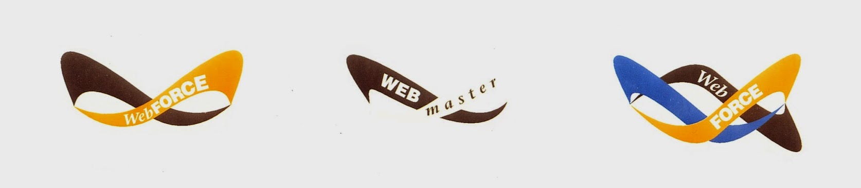
WebFORCE was my first real product launch, so I was very much learning on the job. I didn’t have any experience choosing a logo, but I knew what I liked and what I didn’t. These might have been fine designs, but none of them was close to what I needed.
The problem, though I wasn’t consciously aware of it, was that I didn’t really need an actual “logo”. I was launching a product line, not a new company – and SGI already had an awesome 3D-based logo. What I needed was some sort of “visual identity” that could anchor the marketing. And getting to that would take a surprising route.
Part of what I liked about the name “WebFORCE” was that it seemed to fit really well with a messaging element that I had come up with a few weeks earlier, the phrase “To author and to serve.” It was inspired by the motto of the LAPD, which I knew from TV shows like Adam-12 and Dragnet, “To protect and to serve.”
“To author and to serve” fit WebFORCE so well, that within days it became the official tagline for the product line. And it would also serve as key inspiration for the design of the product line’s ultimate visual identity – from a team that wasn’t even tasked with designing it!
A major component of the WebFORCE launch was an aggressive million dollar print advertising campaign. As soon as the project was funded, I started frequent meetings with the ad agency that SGI had recently begun working with, Poppe Tyson.
At one of those, I must have mentioned that I was struggling a bit to get the right logo developed. To my surprise, the creative team at the agency proactively took on the challenge. The next meeting opened with a sort of “hope you don’t mind” intro. And then they showed me a big bold design they had developed for WebFORCE:

It certainly lacked the simplicity of a traditional corporate logo, but this was a visual identity worthy of the first “web” brand. It had the color and depth one would expect of Silicon Graphics (including its embrace of purple). And it had sufficient breadth and scale to encompass the SGI logo as a supporting (and central) element. In short, it seemed perfect then – and it holds up well 20 years later.
And now, we had all that we needed to get started on creating print ads, a brochure, data sheets, and a launch video. To be continued…

[…] To be continued… […]
[…] team at Poppe Tyson, SGI’s ad agency of record, who had already blown me away with creating a killer logo for WebFORCE, really killed it with what may the very first print ads for any web product. The flagship ad, that […]